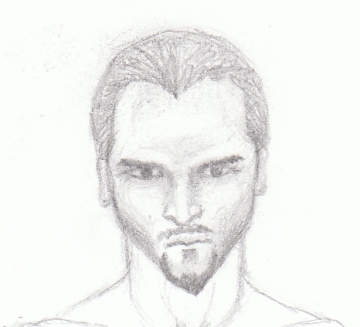
Those of you who have read the manuscript may be interested in how I pictured the characters. Lord Kildas is my favorite character as far as his looks go. He is well-built, regal, and handsome. Oh, and he is a good guy too. Lord Kildas’ head is a little too big in this sketch but other than that, I think he looks great. Lord Kildas is from the Raven clan. The sketches at the top left are meant to be the symbolism for the Raven clan.

The next sketch is of King Haban. I wanted him to look sinister so I gave him a narrow chin, but I think it is just a bit too narrow. This won’t be too difficult to fix.

You probably already saw the sketch of Tomis Dukar in the previous post, but here he is again. This is the second version of Tomis I drew after the first one didn’t work out at all. See a color version of the first one next (at the very end of this post).

Tomis looks too much like a gilr in this finished color version of the book cover. His hair is too long and he looks mean. Tomis is the main character and a good guy. He has had a difficult childhood, hense the angry look, but after seeing this finished version, I don’t think I want him to look angry on the book cover.


